AWS Business Intelligence Blog
Star migrates from simple reporting to rich, interactive analytics with Amazon QuickSight
 |
All your trusted BI capabilities of Amazon QuickSight now come with powerful new AI features that integrate chat agents, deep research, and automation in one seamless experience with Amazon Quick Suite! Learn more » |
This is a guest post by Anna Shumbasova from Star.
In this post, we share how Star achieved rich, interactive analytics using Amazon QuickSight. Star is an end-to-end innovation consultancy working in a variety of industries, including Automotive & Mobility, HealthTech, FinTech, and AdTech & MarTech. Our mission is to support our clients at every step of their digital journey from product ideation and design through launch, full-stack development, compliance, and post-market evolution.
Through a close co-creation process, we build solutions focused on impact, scalability, and performance. Our work with clients such as Lufthansa, NTT Data, Paidy, Zeiss, Xerox, Panasonic, Walmart, Analog Devices, BMW Group, SAIC, NIO, Skin Analytics has impacted over 500 million people worldwide.
As part of our commitment to provide enduring value to our clients while driving internal efficiency, we embarked on a project called the Star KPI Dashboard.
We already meticulously analyzed operational and financial data. Now, we wanted to consolidate this critical information into dynamic Star KPI Metrics Dashboards. These dashboards would allow for easy analysis of data from different angles, facilitating data-driven decision-making across the organization.
Our goal was to create a centralized platform that seamlessly integrates data from multiple domains, enabling easy access to mission-critical information and key performance indicators (KPIs) for informed business decision-making. We sought to enhance our existing in-house developed systems by seamlessly integrating a robust business intelligence (BI) platform and embedded analytics.
This integration streamlines data presentation, automates processes, and provides data intelligence to ensure accurate real-time data processing while monitoring crucial business elements that prompt action. At the same time, we wanted to include features for better collaboration while supporting access from all devices through a consistent design.
Overcoming technical challenges with increased complexity
Initially, we were using a different data visualization tool. Although we enjoyed using it and built a stable dashboard with complex visualizations, we faced technical challenges as our needs grew more complex. Specifically, we encountered unexpected behavior when using certain complex visualizations resulting in degraded performance and unstable system behavior.
These limitations hindered our ability to create and utilize visualizations. Moreover, we struggled with limited data source connectivity, accessibility issues, and maintainability. At the same time, we were looking to further enhance data security.
Due to these constraints, generating new reports took an extended amount of time, discouraging us from exploring new KPIs through our dashboards. Additionally, every slice-and-dice analysis required producing a new report, further adding to our time-to-value by resulting in five reports instead of just one.
As a result, we needed a platform that offered more robust data source connectivity, accessibility, security, maintainability, and scalability options. We also wanted strong visualization capabilities, including the ability to create interactive objects and illustrate different types of data on a single visual object.
After conducting thorough research, including running proofs of concept and cost-benefit analysis, we ultimately selected QuickSight, a unified, serverless BI service, for the following reasons:
- Scalability – The platform is highly scalable and offers preprocessing options for data and a rich marketplace with pre-built templates and dashboards
- Comprehensive visualizations and ease of use – QuickSight offers impressive visualization capabilities, allowing us to create complex dashboards and interactive objects with ease
- Cost-effective – QuickSight helped us expand to a wider audience affordably
In addition, QuickSight offers a wide range of data source connectivity options, real-time data processing, and incremental updates. It also provides role-based access to dashboards and BI data, enabling us to define different work areas per department or unit automatically and securely.
Overall, QuickSight has helped us to create powerful dashboards that provide valuable insights to our colleagues, partners, and stakeholders.
Delivering the flagship Star KPI Dashboard
Our journey with QuickSight began on November 26, 2021. Over the course of 5 months, we diligently worked on deployment, including planning, delivery, development, and continuous evolution. It’s incredible to think that we started with virtually no knowledge about QuickSight, yet managed to launch an impressive prototype in just 3 months!
During planning, we identified the need for a new BI system and defined its scope, growth plans, and development goals.
The delivery phase culminated in the release of our flagship Star KPI Dashboard. Since then, we have developed three additional dashboards with QuickSight to visualize human resources metrics, project manager and account owner forecasting accuracy, and financial analytics.
We build and deliver financial metrics based on management reports, industry P&L split, and project profitability reports enabling users to view KPIs on revenue distribution by location and industry. Users can compare revenue metrics, including revenue vs. expenses, actual vs. target, and actual vs. planned vs. forecast. They can also dive into revenue cost expenses; selling, general, and administrative expenses (SG&A), and revenue analytics per our units.
Moreover, we enable users to slice and dice into revenue and profit by industry across various domains like AdTech & MarTech, Automotive & Mobility, FinTech, and HealthTech. We provide not only revenue and profitability but also the ability to slice and dice into cost and SG&A, gross margin and direct margin, and gross and direct margins distributed by account, by department, by project, and by industry, divided by Star business units. We have forecasting, plans, and targets and once the period ends, we compare with actual data. Our solution enables you to examine performance across 6 consecutive months or two quarters, fostering in-depth analysis rather than limiting you to a month-by-month approach.
Now, we are evolving the Star KPI Dashboard. During this phase, we actively engage with our internal users, gathering their feedback and requirements. These insights serve as the driving force behind our continuous improvement efforts, ensuring our dashboards meet and exceed expectations. In line with our commitment to innovation, we regularly introduce new dashboards including our Diversity and Inclusion Dashboard in March 2023.
The following is a screenshot of the Summary tab in our Star KPI Dashboard. Note that the data presented in these visualizations is for demonstration purposes only and is not based on actual input.
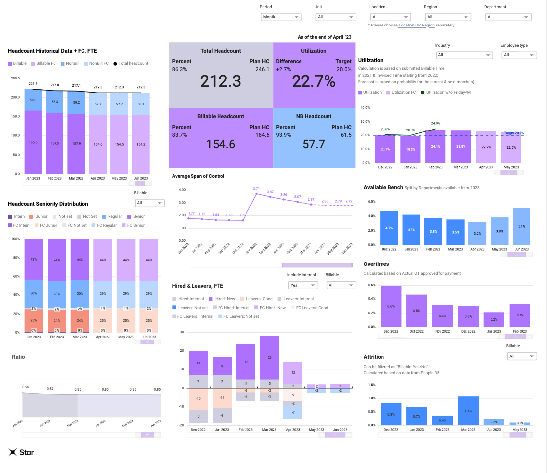
By consistently improving our approaches to meet stakeholders’ needs, we have successfully enhanced the functionality and complexity of our visual storytelling. This has given users greater control, interactivity, and analysis of the numerical data and figures down to a granular level.
Solution overview
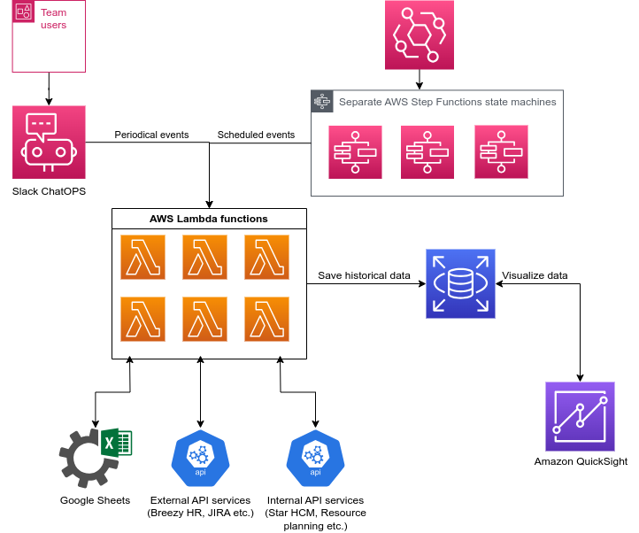
Our solution architecture uses AWS Lambda, Amazon EventBridge, AWS Step Functions, and Amazon Relational Database Service (Amazon RDS) for PostgreSQL. The key components are as follows:
- Data sources – The architecture involves multiple data sources, including Google Sheets documents, internal self-developed company services (Resource Planning Tool, Star HCM Solution), and third-party services such as Breezy HR, Atlassian Jira, Peakon, and Salesforce.
- EventBridge – To trigger the Lambda functions, we use EventBridge with a scheduled event.
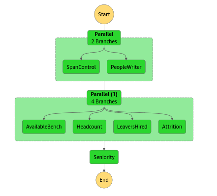
- Step Functions – When the scheduled event occurs, it triggers a Step Functions state machine. It is used to run Lambda functions in parallel or sequentially to extract data from the different data sources.
- Lambda – The Lambda functions extract data from the different data sources as defined in Step Functions.
- Data transformation – After the data is extracted, the Lambda functions transform the data as needed. This could involve cleaning up the data, reformatting it, or performing calculations.
- Amazon RDS for PostgreSQL – The transformed data is then uploaded into an RDS for PostgreSQL instance to save historical data.
- QuickSight – Finally, QuickSight is used to retrieve data from the instance and create visualizations and dashboards.
The following diagram illustrates these main services and components.
The following diagram illustrates a sample Step Functions workflow.
Seamless user access with single sign-on
Users can directly access QuickSight by authenticating through AWS IAM Identity Center with Google SAML.
Additionally, users have the option to access QuickSight through an internal embedded site, enhancing user access speed. In this embedded scenario, we use Amazon Cognito with Google as a federated identity provider (IdP) in the user pool. This ensures secure authentication for accessing QuickSight dashboards and sessions within the embedded site. The site is created using Amazon API Gateway and Lambda functions, providing a seamless experience.
Confidence to focus on building highly functional dashboards
With QuickSight, we create highly functional dashboards that wouldn’t have been possible without it. By taking care of data safety, QuickSight allowed us to fully focus on dashboard building. The ability to create custom functions and make changes in datasets significantly increased the functionality of our dashboards, while reducing the need for workaround solutions.
Once we became familiar with the syntax, we began creating monthly, quarterly, and yearly aggregations without having to layer visuals, as shown in the following screenshots.
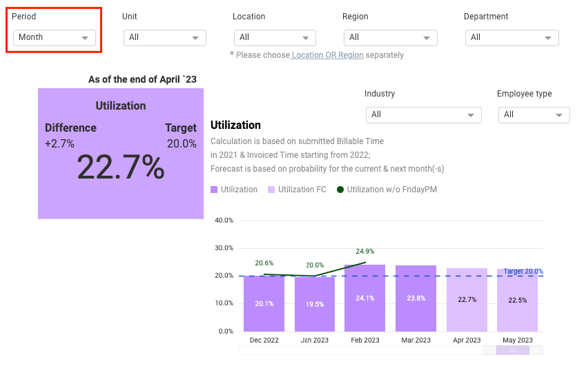
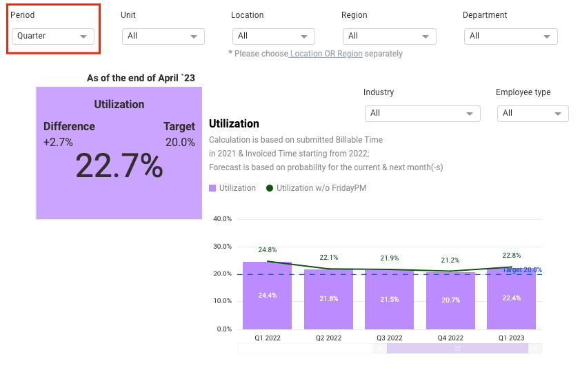
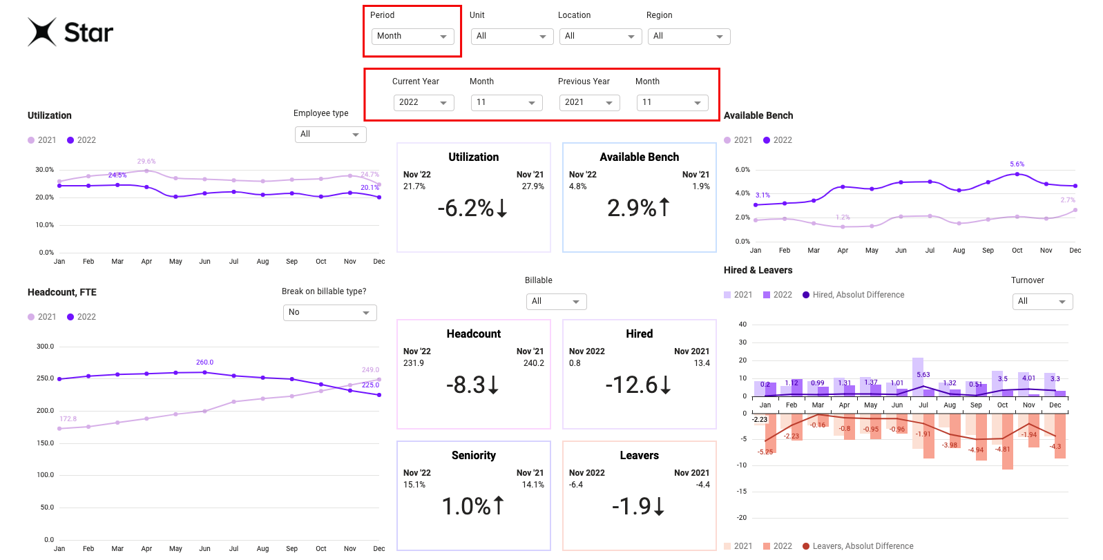
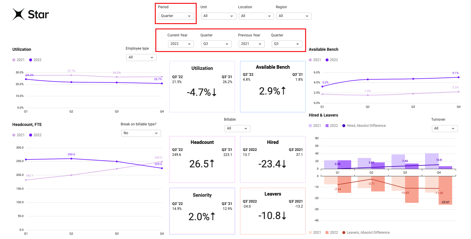
Moreover, QuickSight has allowed us to make year-over-year comparisons with custom period aggregation, which means that we can display yearly differences for both months and quarters. This has made our dashboard more interactive and engaging.
To give an example of our work, the following screenshots show the year-over-year comparison functionality.
On behalf of the Star KPI Dashboard Team, I can say that QuickSight has given us the confidence to stop worrying about losing progress and feel more confident in the security of our data.
Migrated from one-dimensional reporting to rich, interactive analytics
Through our transition to QuickSight, we have embraced the future by transcending traditional data visualization. We now engage with our data interactively, exploring various ways to aggregate and dissect it, opening new doors for valuable insights. Instead of taking months to create new reports, users are able to answer most questions through detailed slice-and-dice options within the dashboards. Users are also able to see how metrics are behaving in near-real time. After using the new dashboards, users have commented on how they are able to process their data better, understand the key issues, and get actionable answers to their questions.
We’ve also extended the reach of our Star KPI Dashboards beyond the management team to include industry directors, location managers, project managers, and lead managers. This allowed us to expand our audience sixfold, resulting in greater value metrics, such as increased efficiency gains for the organization and internal users. We were able to achieve BI growth and do more without expanding our BI team or increasing our costs.
By removing the undifferentiated heavy lifting, our BI team is able to partner better with the business teams and build more KPIs and advanced dashboards that answer critical business questions for our users, enabling data-driven action.
In addition, using SPICE (Super-fast, Parallel, In-memory Calculation Engine) has improved dashboard performance, enhancing the user experience.
Our overall data architecture provides several benefits that help us provide a better user experience cost-effectively:
- Scalability – The use of serverless services such as Lambda, Step Functions, and EventBridge enables the architecture to scale automatically based on the volume of data and the number of users. This ensures that the system can handle large volumes of data and requests without any performance degradation.
- Flexibility – The architecture is flexible and can be easily adapted to different data sources and reporting requirements. The use of Lambda functions for data extraction and transformation allows for custom logic to be applied to the data. Additionally, the use of Step Functions provides the flexibility to run Lambda functions in parallel or sequentially based on the requirements.
- Reduced turnaround time – By automating the data extraction, transformation, and loading process using serverless services, the architecture reduces the turnaround time for data reporting and visualization. This ensures that the data is available for analysis and decision-making in a timely manner.
- Improved performance – The use of Amazon RDS for the storage of the transformed data ensures high performance and availability. Amazon RDS provides automatic scaling, backups, and replication, which ensures that the data is always available and can be accessed quickly.
- Cost-effective – The use of serverless services and managed databases such as Amazon RDS ensure a cost-effective solution. This is because the services are only charged based on the actual usage, without any upfront costs or ongoing maintenance fees.
Looking to the future
At Star, we prioritize setting clear and specific goals for mission-critical teams and their dashboards. This enables us to track progress, provide updates to stakeholders, and continually improve QuickSight based on user feedback and evolving business needs.
Throughout the process of deploying, developing, and evolving our QuickSight dashboards, our team places great emphasis on rigorous testing. In addition to addressing any issues that arise on our end, we proactively provide cases for technical support and fixes to AWS. Our team takes pride in contributing to the global improvement of the QuickSight product for all AWS Community users. This commitment to quality and collaboration sets our QuickSight story apart.
To learn more about how QuickSight can help your business with dashboards, reports, and more, visit Amazon QuickSight.
To learn more about how Star helps enterprises and start-ups create and unearth exponential value by combining the power of emerging technologies with empathy for the end-user, society, and the planet, visit https://star.global/.
Special thanks to Aliona Pogorelaya, Artem Syvohlaz, Daryna Nedilko, Igor Dudchenko, Irina Fabarovska, Kirill Shapran, Maxim Maruhnyak Oleksandr Morochenets, and Oleksii Maksymiv for their invaluable contributions. This post and our work would not have been possible without their amazing contributions.
About the Author
 Anna Shumbasova is the Delivery Operations Lead at Star, where she focuses on streamlining processes, ensuring on-time delivery, and achieving operational excellence, a.k.a. organizing the chaos. With her strong financial background, she is the master of organizing the integration of new and ongoing critical dashboards powered by the Amazon QuickSight BI platform. Anna sets up and defines the backlog to prioritize clients’ needs and processes with internal technical implementation and product development, and is responsible for strategic global migrations, transformation processes, and identification of the roadmap to migrate from as-is to a to-be environment.