AWS Big Data Blog
10 visualizations to try in Amazon QuickSight with sample data
If you’re not already familiar with building visualizations for quick access to business insights using Amazon QuickSight, consider this your introduction. In this post, we’ll walk through some common scenarios with sample datasets to provide an overview of how you can connect your data, perform advanced analysis and access the results from any web browser or mobile device.
The following visualizations are built from the public datasets available in the links below. Before we jump into that, let’s take a look at the supported data sources, file formats and a typical QuickSight workflow to build any visualization.
Which data sources does Amazon QuickSight support?
At the time of publication, you can use the following data methods:
- Connect to AWS data sources, including:
- Amazon RDS
- Amazon Aurora
- Amazon Redshift
- Amazon Athena
- Amazon S3
- Upload Excel spreadsheets or flat files (CSV, TSV, CLF, and ELF)
- Connect to on-premises databases like Teradata, SQL Server, MySQL, and PostgreSQL
- Import data from SaaS applications like Salesforce and Snowflake
- Use big data processing engines like Spark and Presto
This list is constantly growing. For more information, see Supported Data Sources.
Answers in instants
SPICE is the Amazon QuickSight super-fast, parallel, in-memory calculation engine, designed specifically for ad hoc data visualization. SPICE stores your data in a system architected for high availability, where it is saved until you choose to delete it. Improve the performance of database datasets by importing the data into SPICE instead of using a direct database query. To calculate how much SPICE capacity your dataset needs, see Managing SPICE Capacity.
Typical Amazon QuickSight workflow
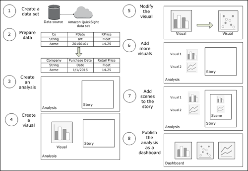
When you create an analysis, the typical workflow is as follows:
- Connect to a data source, and then create a new dataset or choose an existing dataset.
- (Optional) If you created a new dataset, prepare the data (for example, by changing field names or data types).
- Create a new analysis.
- Add a visual to the analysis by choosing the fields to visualize. Choose a specific visual type, or use AutoGraph and let Amazon QuickSight choose the most appropriate visual type, based on the number and data types of the fields that you select.
- (Optional) Modify the visual to meet your requirements (for example, by adding a filter or changing the visual type).
- (Optional) Add more visuals to the analysis.
- (Optional) Add scenes to the default story to provide a narrative about some aspect of the analysis data.
- (Optional) Publish the analysis as a dashboard to share insights with other users.
The following graphic illustrates a typical Amazon QuickSight workflow.
Visualizations created in Amazon QuickSight with sample datasets
Visualizations for a data analyst
Source: https://data.worldbank.org/
Download and Resources: https://datacatalog.worldbank.org/dataset/world-development-indicators
Data catalog: The World Bank invests into multiple development projects at the national, regional, and global levels. It’s a great source of information for data analysts.
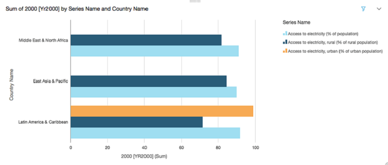
The following graph shows the percentage of the population that has access to electricity (rural and urban) during 2000 in Asia, Africa, the Middle East, and Latin America.
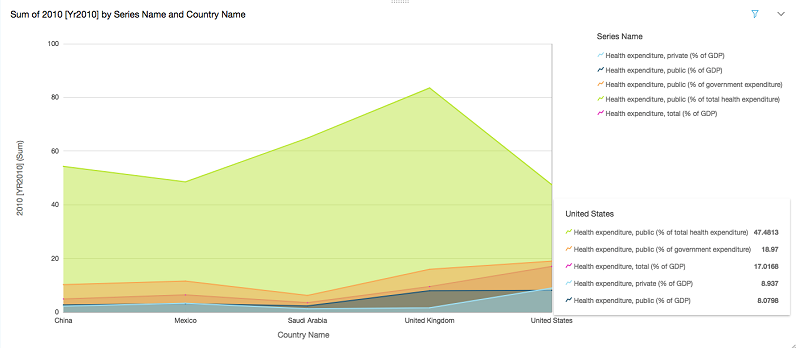
The following graph shows the share of healthcare costs that are paid out-of-pocket (private vs. public). Also, you can maneuver over the graph to get detailed statistics at a glance.
Visualizations for a trading analyst
Source: Deutsche Börse Public Dataset (DBG PDS)
Download and resources: https://thinkwithwp.com/public-datasets/deutsche-boerse-pds/
Data catalog: The DBG PDS project makes real-time data derived from Deutsche Börse’s trading market systems available to the public for free. This is the first time that such detailed financial market data has been shared freely and continually from the source provider.
The following graph shows the market trend of max trade volume for different EU banks. It builds on the data available on XETRA engines, which is made up of a variety of equities, funds, and derivative securities. This graph can be scrolled to visualize trade for a period of an hour or more.

The following graph shows the common stock beating the rest of the maximum trade volume over a period of time, grouped by security type.

Visualizations for a data scientist
Source: https://catalog.data.gov/
Download and resources: https://catalog.data.gov/dataset/road-weather-information-stations-788f8
Data catalog: Data derived from different sensor stations placed on the city bridges and surface streets are a core information source. The road weather information station has a temperature sensor that measures the temperature of the street surface. It also has a sensor that measures the ambient air temperature at the station each second.
The following graph shows the present max air temperature in Seattle from different RWI station sensors.

The following graph shows the minimum temperature of the road surface at different times, which helps predicts road conditions at a particular time of the year.

Visualizations for a data engineer
Source: https://www.kaggle.com/
Download and resources: https://www.kaggle.com/datasnaek/youtube-new/data
Data catalog: Kaggle has come up with a platform where people can donate open datasets. Data engineers and other community members can have open access to these datasets and can contribute to the open data movement. They have more than 350 datasets in total, with more than 200 as featured datasets. It has a few interesting datasets on the platform that are not present at other places, and it’s a platform to connect with other data enthusiasts.
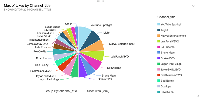
The following graph shows the trending YouTube videos and presents the max likes for the top 20 channels. This is one of the most popular datasets for data engineers.
The following graph shows the YouTube daily statistics for the max views of video titles published during a specific time period.

Visualizations for a business user
Source: New York Taxi Data
Download and resources: https://data.cityofnewyork.us/Transportation/2016-Green-Taxi-Trip-Data/hvrh-b6nb
Data catalog: NYC Open data hosts some very popular open data sets for all New Yorkers. This platform allows you to get involved in dive deep into the data set to pull some useful visualizations. 2016 Green taxi trip dataset includes trip records from all trips completed in green taxis in NYC in 2016. Records include fields capturing pick-up and drop-off dates/times, pick-up and drop-off locations, trip distances, itemized fares, rate types, payment types, and driver-reported passenger counts.
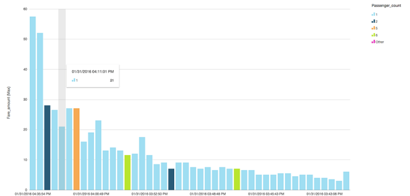
The following graph presents maximum fare amount grouped by the passenger count during a period of time during a day. This can be further expanded to follow through different day of the month based on the business need.
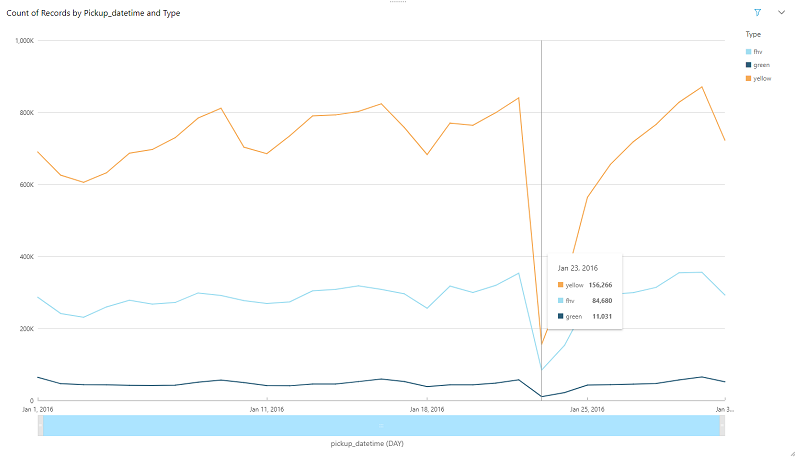
The following graph shows the NewYork taxi data from January 2016, showing the dip in the number of taxis ridden on January 23, 2016 across all types of taxis.
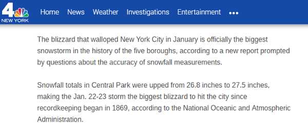
A quick search for that date and location shows you the following news report:
Summary
Using Amazon QuickSight, you can see patterns across a time-series data by building visualizations, performing ad hoc analysis, and quickly generating insights. We hope you’ll give it a try today!
Additional reading
If you found this post useful, be sure to check out Amazon QuickSight Adds Support for Combo Charts and Row-Level Security and Visualize AWS Cloudtrail Logs Using AWS Glue and Amazon QuickSight.

About the authors
 Karthik Odapally is a Sr. Solutions Architect in AWS. His passion is to build cost effective and highly scalable solutions on the cloud. In his spare time, he bakes cookies and cupcakes for family and friends here in the PNW. He loves vintage racing cars.
 Pranabesh Mandal is a Solutions Architect in AWS. He has over a decade of IT experience. He is passionate about cloud technology and focuses on Analytics. In his spare time, he likes to hike and explore the beautiful nature and wild life of most divine national parks around the United States alongside his wife.