AWS for Games Blog
The Evolution of the Amazon Lumberyard User Experience
Authored by Yuyi Hsu

I lead the User Experience (UX) team for Amazon Lumberyard. My team works closely with the Lumberyard Engineering and Product Management teams to research and design the user experience of the tools that game developers and content creators use to build their games.
The Observation
I come from a product design background. My past experience at Amazon ranged from designing the shopping experience on the Amazon.com and Amazon App Store, to defining the broadcasters and spectators experience on Twitch, to innovating around the pickup and delivery experience for Amazon customers and delivery associates. Each of these products or services required an intuitive and delightful experience so that the general public might enjoy the journey and come back to use the products and services again.
When I joined the Lumberyard team, I was overwhelmed a bit by the complexity of Lumberyard and the technology behind it. So, I spent time interviewing and observing how the game teams use Lumberyard to build their games, and how various roles, such as Game Designers, Animators, Environment Artists, Tech Artists, VFX Artists, Audio Designers, and Developers, collaborate with each other in the workflows to build the game content together. These user research activities help me understand what customers want and why they want it. I also realized that even though many of these professionals have worked in the game industry for years, their desire for an intuitive and easy-to-use game engine isn’t too different from the general consumers who want a user-friendly product to make their live easier and enjoyable.
While talking to game developers, my team and I also realized that a game engine is similar to other digital content creation tools—such as Adobe Photoshop, Sketch, or Maya, for example—used by creative professionals, who value their creativity and creative flow. When the creators are in the creative flow—some call it being “in the zone”–they become hyper-focused. This state leads to a sense of ecstasy and clarity, and then to an abundance of innovative content and ideas. However, if the creators are distracted from their creative flow, it might take them hours to get their focus back; or even worse, they might lose their ideas altogether. Therefore, it’s important to know that when we offer the tools to help these creative professionals, the tools should avoid disrupting this creative flow–and furthermore should become almost invisible in the creative process so the creators can be fully immersed in creating, rather than compensating.
The Realization
With the above understanding, the UX team analyzed the Lumberyard experience further to understand where we were in terms of assisting the creators to enter into this creative flow and thereby generating creative content efficiently. From there, we defined the following tenets for Lumberyard user experience.
- Promote efficiency – We know content creators value productivity. We aspire to optimize workflow and reduce every click to free the content creators’ minds so they can fully immerse in their creative flow.
- Foster learning – We understand that game creation has a high barrier to entry for most developers. We strive to provide an error tolerant and trustworthy environment that encourages users to explore their ideas with confidence, and use progressive disclosure to promote good decision making and reduce cognitive load.
- Empower creativity – We recognize creativity is important to content creators. We provide an environment with a set of building blocks that enable them to prototype and test their ideas quickly.
The tenets gave us a sense of purpose and direction, helping us set priorities for the future of Lumberyard.
We then identified several overarching themes to improve the user experience. The most fundamental one was building the Design System to unify the interactions and workflows across Lumberyard, which was publicly called Lumberyard UI 2.0.
The First Step to the Evolution
The previous Lumberyard UI was inherited from CryEngine. Over the years the user interface and workflows have become too divergent as various features and tools were added, which prevented users from learning and building efficiently. We built the Lumberyard Design System as the first step to ensure consistency and cohesiveness across the tools and workflows, which ultimately leads to better productivity and efficiency for the creators.
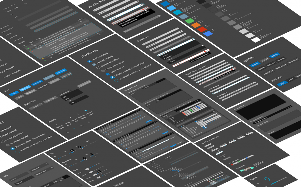
The Lumberyard Design System is more than a uniform aesthetic, it’s defined as a single source of truth, which groups all the elements needed to allow teams to design, realize, and develop the features and tools content creators use to build many types of game content. It was grounded with user testing and industry-standard interaction patterns to ease on-boarding, improve editor efficiency, and support the development of custom tools and interface extensions. The systems consists of the following-
UI Components and UX Patterns

We’ve identified 35+ common UI controls in Lumberyard, including buttons, input fields, tables, component cards, etc. Each of the components are modular, and each component has design guidelines, use cases, code snippets, and APIs, so tool developers can easily extend their own tools and workflows using these components as building blocks, while maintaining a coherent and standardized user experience.
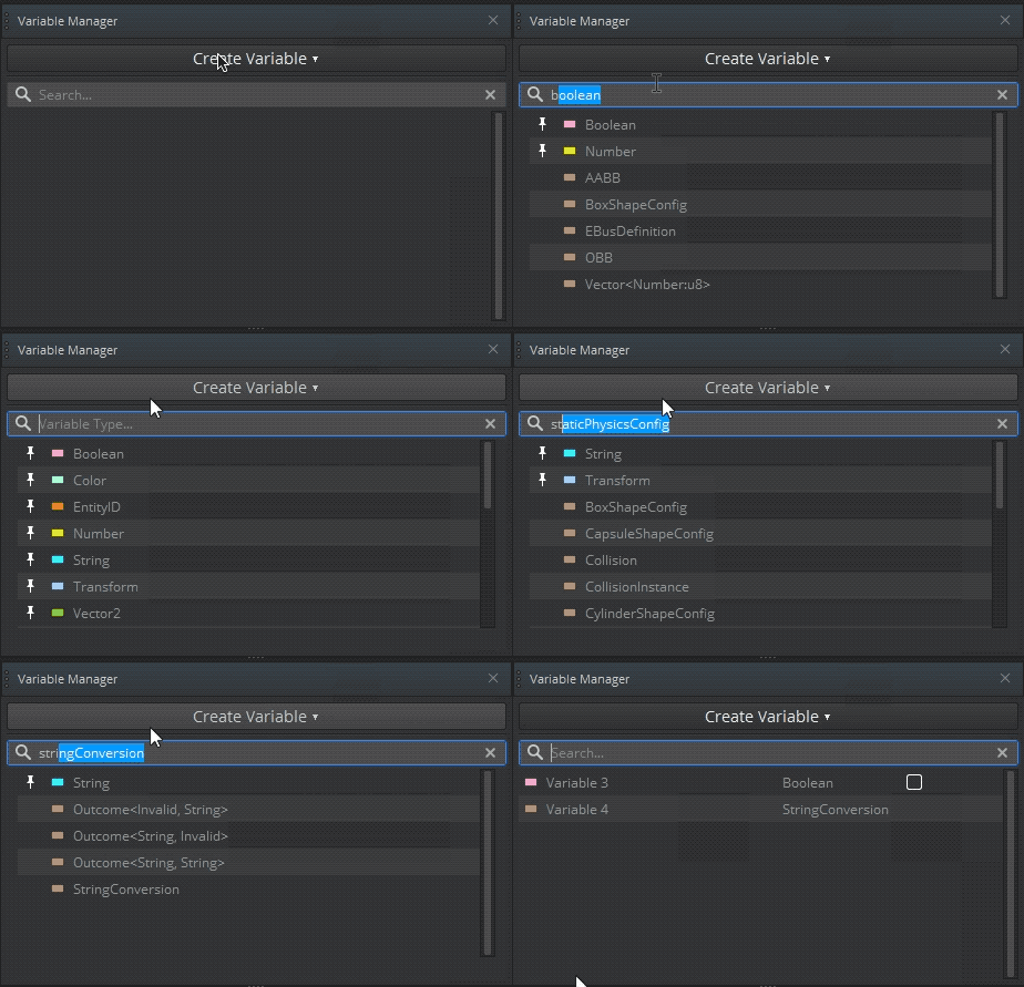
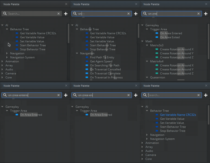
In addition to the UI components, we also identified the common interaction and workflow patterns, such as search, filter, file management, drag and drop, windows docking, etc., and built them into the Pattern Library. Each pattern described the detailed interaction specs, use cases, dos and donts, so that the game devs can follow them and build their own tools and workflows that are consistent with the rest of the Lumberyard.


Look-n-Feel
The visual design language is the core of a design system. It is made up of the following four main categories:
- Color: The new branding colors support better accessibility and visibility for people with visual impairment.
- Typography: We unified the typography to support better readability and clearer content format.
- Sizing and spacing: We redefined the sizing and spacing of the UI layout and UI components to create rhythm and balance, make the content easier to read.
- Iconography: We redesigned all the icons to make them meaningful, and convert them into SVG format for better scalability and readability on different resolutions.


UI Dev Library
We built the Lumberyard UI Dev Library, which provides developers with access to the same UI components used throughout Lumberyard. Using this library, UI developers can build their own tools and extensions for Lumberyard, while maintaining a coherent and standardized UI experience. This custom library provides new and extended widgets, and includes a set of styles and user interaction patterns that are applied on top of the Qt framework – the C++ library that Lumberyard relies on for its UI. The library can be extended to support your own customizations and modifications. Check it out: https://docs.thinkwithwp.com/lumberyard/latest/ui/ui-dev-intro.html

The new UI that was built on the Lumberyard Design System was first released with v1.25, and then subsequently updated in 1.26, and finally moved to General Availability (GA) with 1.27. Throughout this journey, we’ve gathered a lot of customer feedback, which really helped us improve the experience and address missing features.
Through survey data we learned that customers were pleasantly surprised at this direction we are taking and gave us a 4.24 (out of 5) customer satisfaction score. We were also excited to see people respond to our survey with many suggestions for UX improvements in other areas, such as workspace optimization, workflow unification, etc. (Surprisingly, none of them were feature requests!) It shows that our customers do value a game engine with good user experience, and that we are on the right track.
What’s Next
As mentioned above, the UI 2.0 release is just the first step to a larger plan around the delivery of a more intuitive, efficient and content creator friendly Lumberyard. There are many more UI components, interactions, and UX patterns to be unified and built into the design system. We have other initiatives, such as improving the first-time user experience to make it easier for content creators to setup, learn, and build in Lumberyard easily and efficiently, and optimizing the workflows for artists, who have long been neglected in the past. We’ve got a lot of interesting stories about designing and delivering UX for Lumberyard and we’ll share those tales and insights in upcoming installments. Stay tuned!
Lastly, we are always looking for customer feedback. If you want to be part of the journey to redefine the Lumberyard experience with us, please do reach out to us at lumberyard-research@amazon.com. We have user research activities running throughout the year, and we’d love to hear from you!